SWEET PEA TEA
BRAND IDENTITY - LOGO DESIGN - PRODUCT PACKAGING - MARKETING
The Logo
Merging Symbolism & Simplicity
Client: Sweet Pea Tea
Project Summary: Create a simplistic and identifiable logo for Sweet Pea Tea that references a tea leaf blossoming, incorporates a unique font, a letter “P” icon in a soothing green color way.
Design Elements
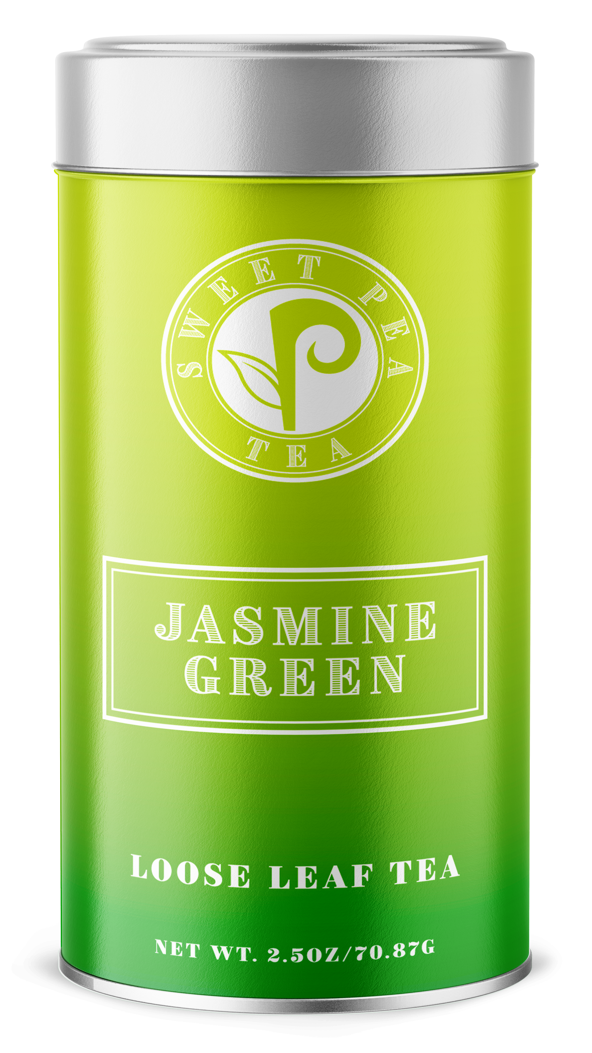
1. Letter "P" Icon: Incorporating the letter P into the logo design was a key requirement for our client. We have crafted a simple yet impactful letter P icon that serves as the focal point of the logo. The icon is designed to be clean, minimalistic, and instantly recognizable. The "P" is seamlessly integrated into the tea leaf blossom, creating a unique visual element that evokes both the brand name, icon and the tea leaf theme.
2. Simplistic Tea Leaf Blossom: To emphasize the connection with tea, we have subtly integrated a tea leaf into the design. It features a simplified illustration of a tea leaf blossoming. Placed in close proximity to the letter P, the tea leaf adds a touch of visual interest without overpowering the overall simplicity of the logo.The design is clean and uncluttered, capturing the essence of a delicate tea leaf unfolding.
3. Unique Font: To ensure the logo stands out and creates a strong visual identity, we chose a font that adds a touch of elegance while maintaining a clean vintage feel. Its balanced letterforms convey a sense of warmth and approachability, aligning with the brand image Sweet Pea Tea wants to project.
4. Soothing Green Color way: To evoke a sense of tranquility and serenity, and to capture the brand's association with tea we have embraced a soothing green color way for the Sweet Pea Tea logo. The selected shade of green is reminiscent of fresh tea leaves and conveys a feeling of natural goodness. This color way creates a soothing and inviting ambiance, further enhancing the overall appeal of the logo.
Conclusion
This logo design for Sweet Pea Tea effortlessly combines simplicity, symbolism, and elegance to create an inviting and recognizable brand identity. With a unique font, a distinctive letter P icon, a subtle tea leaf reference, and a calming green colorway, which perfectly captures the essence of Sweet Pea Tea's products and values. We are confident that this logo will create a lasting impact and help Sweet Pea Tea stand out in the market as a trusted and beloved brand.

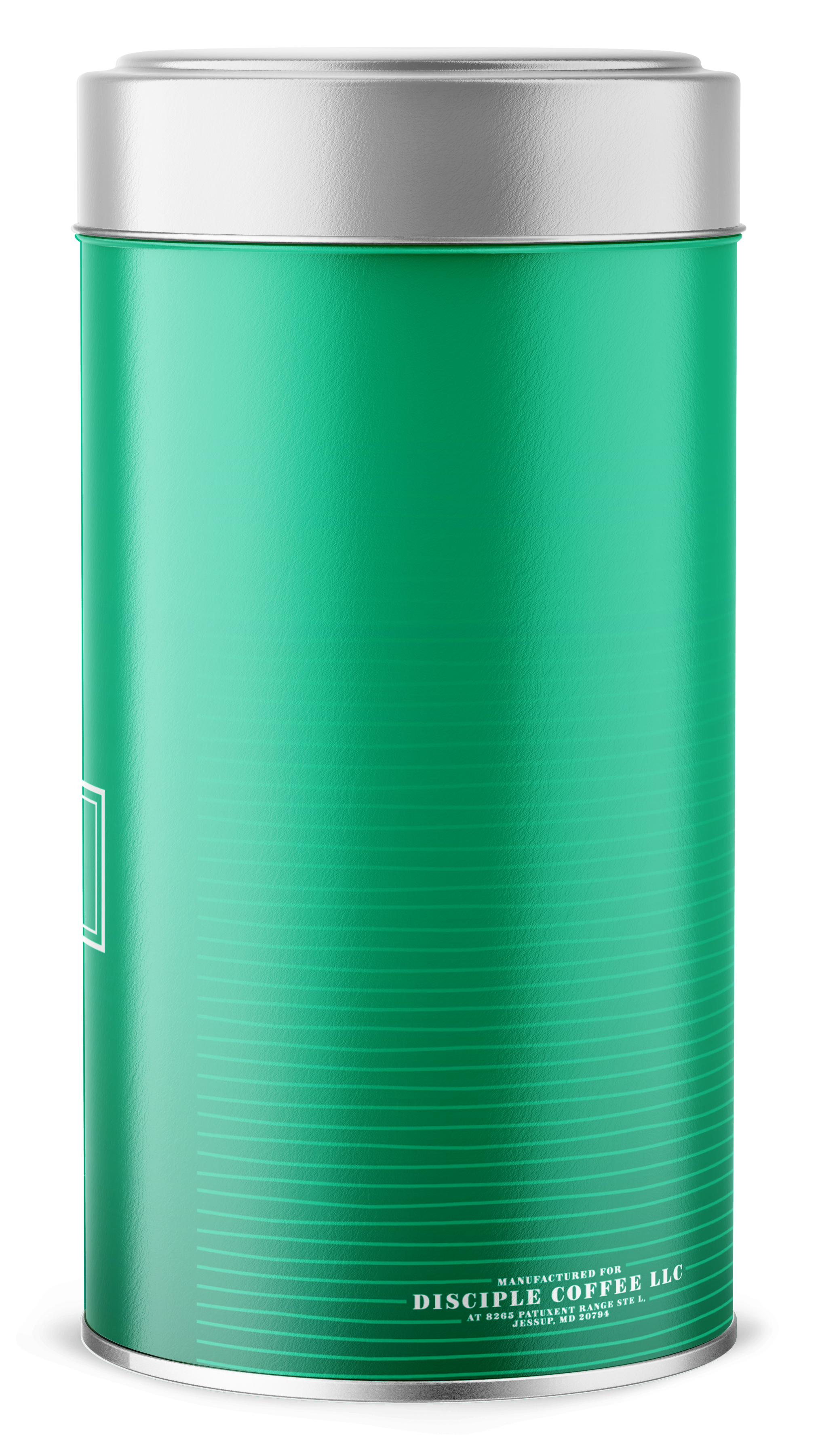
Integrating a delicate wave pattern into the design captures the essence of the gentle ripples found in tea, giving our brand identity a unique texture. This subtle yet alluring detail enhances the depth and intrigue of our product, inviting viewers to explore its intricacies further.
The Product Design
To make our product truly stand out from the crowd, we carefully selected a palette of vibrant colors that beautifully mimic the mesmerizing color change that occurs when tea is steeped. By incorporating this visual element, we not only aim to capture the essence of a calming tea experience, but also to evoke a sense of curiosity and excitement in potential customers.
Throughout the design process, we were mindful of the importance of simplicity. We wanted to create a visually appealing product that effortlessly catches the eye and leaves a lasting impression, without overwhelming the senses. By carefully balancing the vibrant colors and the wave pattern, we achieved a harmonious blend that strikes the perfect chord of visual stimulation and elegance.
In summary, our goal was not just to create a unique product, but to create something that exudes a sense of beauty and captivation. The vibrant colors that mimic tea steeping and the carefully integrated wave pattern serve as the keys to unlocking the visual allure of our creation, enticing customers to explore further.


